Global Support
Flexible & Budget Friendly
UK Based Remote Assistants
One-off Support Available
Affordable
Business
Support Solutions
What would you do with more time?
FREE trial available
Upgrade, downgrade, or cancel at any time.
Pay-as-you-go available
Roll over unused hours
Support plans from £150 per month
Admin, marketing, social media, tech, HR, project management, minutes and more
UK-based virtual assistants
No long term contracts
We provide UK-based virtual assistants , each one skilled in areas such as tech, back office support, project management, HR, admin, customer service and professional minute-taking, to businesses worldwide. We provide business support and business operations to entrepreneurs , business coaches, property developers, sole traders, and medium to large sized enterprises.
With a VA by your side, watch your efficiency soar as they expertly manage tasks that bog you down. From handling emails with finesse to mastering your schedule, a VA transforms your workload, allowing you to zero in on business growth. Imagine lower costs, higher productivity, and a newfound balance in your work life, plus, we offer something that no other remote personal assistant service does. Are you curious to find out what that is?
Family
More time for bedtime stories, extra snuggles, the school run, after school activities and spontaneous day trips
Business
More time to network, work on your business growth, putting yourself where you're needed most, and nurturing your customers
You
More time for lunch dates, gym sessions during the day, extra time in bed and working less hours so you can have more fun

How Does It Work?
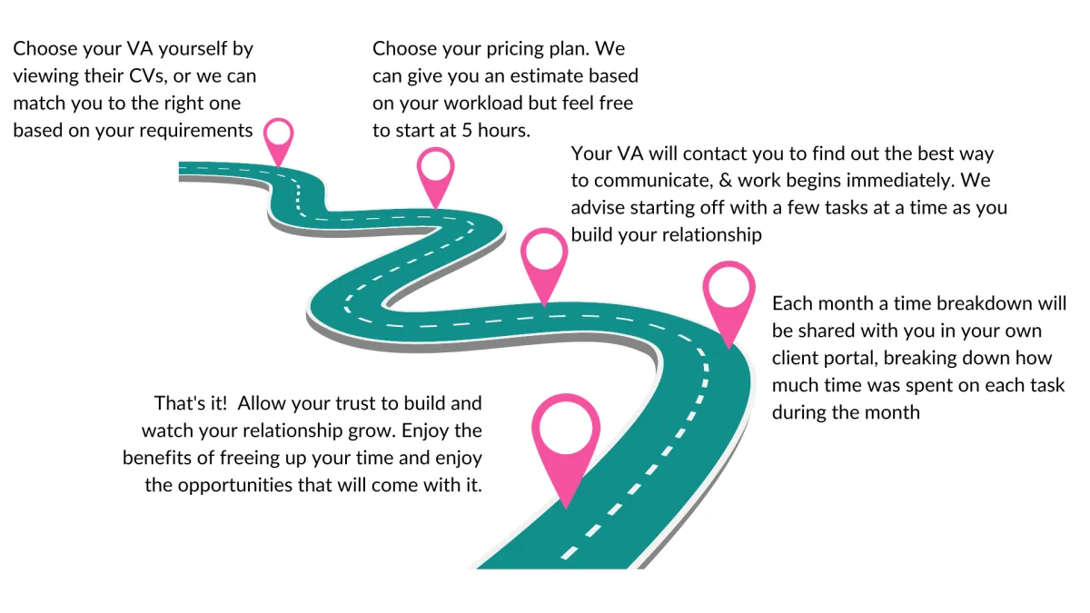
The first step is always in booking a call with us so that we can understand more about the type of support you need, and better direct you on things like how many hours you might need and how much it's going to cost. The process is really quite simple, you book a call, tell us your problem, we listen, then together agree on the best support plan.
We either match you with a virtual assistant based on your requirements, or you can choose from 3 profiles and speak to each one before making a decision. Once you're satisfied you've found a good fit, after speaking to your VA, you then sign up to your business support plan and work starts right away! You will have a dedicated account manager taking care of you for as long as you're signed up with us. So, let's take that first step and book a call with a friendly account manager today.

Monthly Support Plans
Our flexible, affordable monthly support plans to assist you with admin, tech, HR, marketing, back office support, customer service, telephone answering, and professional minute taking.

Pay As You Go
Flexible ad-hoc support as and when you need it.

Business Assistants for Temporary Staff Cover/Project Based Work
Our Business Assistance is a service available to larger organisations looking for temporary or poject based staff and support with business operations.

One-Off Support
One-off support packages for common business problems.
What can 5 more hours per month get you?
1 Extra hour for playing with your kids
30 Minutes to exercise or do something for you
1 Hour to catch up with an old friend for lunch
1 Hour to spend on that project you never have time for
30 minutes to sort out your inbox
1 Hour to spend on business growth

Simply Admin
From £150/Month
Emails, invoices and more
Document creation
Diary and calendar management
Admin + Tech
From £225/Month
Most Popular
CRM, Automation, websites
Ideal for business coaches
Software troubleshooting
System set-up & maintenance
Admin + Marketing
From £225/Month
Social media management
Ad campaigns
PR Support
Admin + HR
From £200/Month
Fully qualified HR VAs
Policies & procedures
Employee management
Frequently Asked Questions
We've been asked it all before...
What happens if I want to cancel my support plan?
You can cancel your support plan at any time however, we advise that you let us know in advance that you would like to cancel before your next reset date. Your reset date is the date you originally started your plan and will be the same date your payment is taken every month. We will cancel your plan and you can use your time until then. Any time left over or already banked, rolls over for up to one month. There are no additional charges involved with canceling your plan. You can cancel your plan by opening the relevant support ticket or contacting your account manager.
What are the benefits of pausing my support plan?
Pausing your plan is a great idea if you have rolled-over time that you would like to use up. Whilst your plan is on pause, you won't be charged anything. We will contact you to check if you want to restart your plan, once your rolled-over time has been used. Pausing your plan rather than canceling it makes it easier as you don't have to set everything up from scratch again. We can pick up where we left off with no delay. You may also want to consider pausing your plan if your cash flow forecast isn't looking good or your business is going through a difficult time, but you will want to resume services at some point in the future. By pausing your plan we can keep in touch with you and simply restart without you having to sign up, once you're ready to get going again. Paused plans are cancelled after 3 months. To pause your plan open the relevant support ticket or speak to your account manager.
What if I want my VA to do something they do not know how to do?
If you ask your VA to perform a task or undertake a project that they cannot do, simply open a new enquiry ticket or contact your account manager and we'll match you with a VA who has the right skills or time. This VA will not usually replace your current assistant unless you want us to do that, but instead, they will split some of the time with your current assistant to complete the necessary work.
What happens if I sign up for a support plan without booking a call?
Not everyone wants to speak on the phone and that's fine! If you know you need support and simply want to dive straight in, you can book your ideal support plan without having to book a call first. We will contact you via email to find out more about your specific needs, and then give you the option to view 3 profiles of assistants we have identified as a good match, or, we can match you to a VA ourselves. Your VA will then contact you to get all the necessary information they need to get started, and it's as simple as that!
Who pays for phone calls, subscriptions and licenses?
If tasks you provide need licenses, specialist software, subscriptions, or similar, these may need to be purchased by you. If you require phone calls to be made, you will need to provide us with a Skype account or similar VoIP system. Alternatively, you can add on a monthly telephone answering service, which gives your VA 500 minutes per month to make calls for you. This is an additional £28 per month. VAs should never have to incur costs to work with you. However, it's always worth asking your VA if they already have a subscription service to something you need or were considering signing up for. If VAs have them already, they usually won't mind using their current subscription.
How do you keep all of my data secure?
Our Virtual Assistants are associates, which means they work as freelancers, not as employees. All associates MUST provide valid insurance to work with us. We also ask them to only use secure password managers to store client information and, to work in the cloud as much as possible, rather than storing information on desktops. How much of that they can do, comes down to how you as a client, shares information with them. We always recommend that our clients use password managers and insist that their assistants do too, we highly recommend 1Password. We are also ICO registered as are our VAs. You can see our certificate by clicking the link in the footer. We are happy to sign NDAs if required and you can request your assistant to sign any additional policies you feel necessary. Our VAs are also offered regular cyber security training, and we work alongside an AI policy to ensure your data is never uploaded via Long Language Models such as ChatGPT.
What happens if I don't use all of my time?
We try to be as flexible as possible, therefore, we allow our clients to roll over their time for up to 1 month. You have access to a bespoke time portal where you can track your banked time. you can also pause your plan until your rolled over time is used up. There aren't many VA agencies that will do that!
Our Virtual Assistants are UK-based and work for people just like you, all over the world. We can work around your time zone, with bespoke schedules organised between you and your dedicated VA. Don't need regular support? We also offer one-off packages for the most common problems business owners face including website support, minute-taking, and CRM and automation assistance. We're here to help you achieve more .

Our services are cost-effective and flexible, and we guarantee your satisfaction. We'll handle your admin tasks, help you manage projects and organise your office, freeing up your time to focus on growing your business or whatever is important to you
Contact Us
01332 460057
Building 15, Unit 1.2 | Cromford Mill | Mill Lane | Cromford | Derbyshire | DE4 3RQ


L.T. VA Services Ltd is a company registered in England and Wales with company number 13629800
